Macro Education
Back1. The Economic Cycle
The economy doesn't move in a straight line — it cycles. It expands, overheats, cools off, and contracts, over and over again. Knowing where you are in that cycle is the single most important input for your portfolio.
We track two things: whether the economy is getting stronger or weaker (Growth), and whether prices are rising faster or slower (Inflation). The direction of each — not the level — determines which economic regime we're in right now.
The key insight: we measure which direction growth and inflation are heading — not how high or low they are. This lets us spot regime shifts before the broader market catches on.
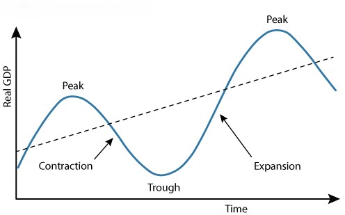
Figure 1: Idealized Business Cycle Phases & Regime Transitions
2. The Compass System
The Macro Compass maps those two forces — Growth and Inflation — into four distinct regimes. Each regime has a clear playbook for which assets tend to win and which tend to lose.
The economy is picking up speed AND inflation is cooling off. This is the sweet spot — everything is going right. Risk assets rally broadly.
↳ What to do: Lean into growth equities, tech, and high-yield. Reduce defensive positions.
Growth is accelerating AND inflation is rising. The economy is running hot. Real assets and companies with pricing power win here.
↳ What to do: Rotate toward commodities, energy, financials, and inflation-protected (TIPS) bonds.
Growth is slowing AND inflation is still rising. The worst of both worlds — corporate profits get squeezed and consumers feel the pinch at the same time.
↳ What to do: Shift to gold, utilities, consumer staples, and cash. Cut equity exposure significantly.
Growth is slowing AND inflation is cooling. A broad economic slowdown. Risk appetite collapses and investors rush to safety.
↳ What to do: Move into long-duration Treasury bonds and the U.S. Dollar. Avoid equities.
3. How We Calculate It
Four independent signals all measure the same two axes — Growth and Inflation. You can view each signal separately on the Quad Map, or blend them into a Consensus view using All Signals mode.
Signal 1 — Economic Data (FRED)
This signal reads hard economic data directly from the Federal Reserve's public database (FRED). We look at things like jobs reports, industrial output, retail sales, and consumer prices. For each series, we ask: is this reading better or worse than the same month last year? And is it improving or deteriorating compared to last month? That direction — not the number itself — tells us which Quad we're leaning toward.
Growth Indicators
- Real GDP & GDI: Baseline economic momentum.
- Industrial Production: Tangible manufacturing output.
- Retail Sales: How fast consumers are spending.
- Nonfarm Payrolls: Employment strength and labor force participation.
Inflation Indicators
- CPI & Core PCE: Headline and structural consumer price pressures.
- PPI (Producer Price Index): What it costs companies to make things.
- Commodity Indices: Real-time raw material prices.
- Wage Growth: Sticky, structural inflation signals.
Signal 2 — ETF Sector Rotation
This signal watches how big institutional investors (hedge funds, pension funds) are moving money between stock market sectors. When capital pours into tech and out of utilities, that's a growth signal. When energy and gold start outperforming Treasury bonds, that's an inflation signal. We measure the momentum of each ETF over the past 3 months and compare it to its own historical range — so we know when a move is unusually large or small. The ETF flows essentially give us a real-time market-based gut-check on what Signal 1 is saying from raw economic data.
For the Curious: How the Math Works
Each ETF's 3-month price momentum is measured and then ranked against its own 12-month history (this ranking is called a "z-score" — it just tells us how extreme the current move is compared to normal). Growth is approximated by comparing tech (XLK) vs. defensive utilities (XLU). Inflation is approximated by comparing energy + gold (XLE, GLD) vs. long-duration Treasury bonds (TLT). The outputs are scaled to match the same units as Signal 1 so they can be blended directly.
Signal 3 — Yield Curve Regime
The bond market is considered smarter than the stock market — and the shape of the Treasury yield curve (the difference between long-term and short-term interest rates) encodes what bond investors collectively expect for future growth and inflation. We don't just look at the current shape — we measure how the shape is changing over the past 60 trading days. A widening gap between long and short rates signals the bond market is pricing in stronger growth ahead. Rising long-term rates signal rising inflation expectations. This signal typically leads the economy by 3–12 months, making it a powerful early-warning tool.
Signal 4 — Nowcast (Where the Puck is Going)
Government economic data is always late. By the time the official GDP report lands, you're looking at numbers from 2–3 months ago. The Nowcast solves this by tracking high-frequency proxy data — jobs, industrial output, retail sales, and inflation readings — to predict what the next official report will show before it's released. Think of it as a real-time estimate of where the economy is heading, not where it's been.
Growth Proxies
- 50% — Nonfarm Payrolls: Highest-conviction read on the real economy.
- 30% — Industrial Production: Manufacturing, mining, and utility output.
- 20% — Retail Sales: Consumer spending velocity.
- 0% — Durable Goods: Tracked but zero-weighted to reduce noise.
Inflation Proxies
- 70% — CPI: The headline inflation metric markets trade on.
- 30% — Core PCE: The Fed's preferred inflation gauge.
How the Forecast Works
For each indicator, we track whether the year-over-year reading has been improving or deteriorating over the past three months. Even if CPI is "high" at 6%, if the last three months came in at 6.5% → 6.2% → 6.0%, the trend is falling — the puck is moving toward lower inflation. Weighted proxy trends are combined to produce a single forecasted Quad before the official figures are released.
4. Why Asset Classes Diverge
Every asset class has a home regime where it naturally thrives. The reason comes down to two things: how future profits are valued (lower interest rates make future earnings worth more today) and how reliable those profits are when growth or inflation shifts. The table below shows what typically outperforms in each regime and why.
| Regime | Why These Assets Move | What Typically Outperforms |
|---|---|---|
|
Q1
Goldilocks
|
Falling inflation means lower interest rates. That makes the future profits of growth companies worth more today — like getting a higher value on money you'll earn 5 years from now. Borrowing costs drop, fueling expansion. | Growth equities, tech (XLK/QQQ), high-yield bonds, consumer discretionary |
|
Q2
Reflation
|
Rising inflation drives up the price of physical goods and raw materials. Companies that own those materials or can pass rising costs on to customers win. Long-dated, fixed-return assets (like tech stocks) lose ground as inflation erodes their projected future value. | Commodities (oil, copper), energy (XLE), gold (GLD), financials, TIPS, value stocks |
|
Q3
Stagflation
|
The worst combination: input costs stay high while revenues slow down, crushing profit margins. Investors flee broad equities. Gold thrives as a store of value when the Fed is caught between fighting inflation and supporting growth. Utilities and staples hold up because people still pay their electric bills and buy groceries no matter what. | Gold (GLD), utilities (XLU), consumer staples (XLP), cash |
|
Q4
Deflation
|
When both growth and inflation fall, central banks cut rates aggressively. Existing bonds — which pay a fixed rate — become extremely valuable. The dollar rallies as investors dump risky assets and demand the most liquid, safest thing they can hold. | Long-duration Treasury bonds (TLT), U.S. Dollar (UUP), short-duration assets |
5. The Yield Curve as a Leading Indicator
When you lend someone money for 10 years, you expect a higher interest rate than if you only lent it for 2 years — because more can go wrong over a longer period. The yield curve is just the gap between those long-term and short-term government borrowing rates. When that gap is wide and growing, bond investors are optimistic about the future. When it narrows or flips negative (inverts), they're pricing in trouble ahead.
We track how the curve changes over the past 60 trading days to identify four distinct regimes. This signal tends to lead the economy by 3–12 months, making it one of the best early warnings available.
Bull Steepener
The Fed is cutting rates. Short-term rates collapse quickly while long-term rates stay sticky — the bond market is already pricing in a recovery. Credit conditions ease and lending picks up. The most bullish regime for equities, high yield, and cyclicals.
↳ What this means for you: This is a green light — risk assets tend to perform well in the quarters ahead.
Bear Steepener
Inflation expectations are rising. The long end of the curve sells off (bond prices fall, yields rise) while the Fed hasn't yet moved short rates higher. Growth is still OK but the economy is heating up. Favors TIPS, commodities, and real assets.
↳ What this means for you: Rotate away from long-duration bonds; tilt toward real assets and inflation hedges.
Bear Flattener
The Fed is actively raising rates to fight inflation. Short-term rates surge upward while long-term rates rise more slowly because the bond market is already pricing in a future slowdown. The most hostile environment for equities. Favors cash, T-bills, short-duration bonds, and the U.S. Dollar.
↳ What this means for you: Raise cash, shorten duration, and limit equity exposure — slowdown risk is building.
Bull Flattener
Both growth and inflation are cooling. The long end of the curve rallies strongly as bond investors price in Fed cuts and falling inflation. The curve may approach inversion. Favors long-duration bonds (TLT), gold, and utilities.
↳ What this means for you: Shift toward bonds and defensive assets — the market is anticipating a meaningful slowdown.
Key Spreads to Watch
The most-watched recession signal. Has gone negative (inverted) before every U.S. recession since 1955. When short-term rates exceed long-term rates, it means the bond market thinks the Fed has tightened too much.
The New York Fed's preferred recession predictor. Research shows this spread is even more reliable than the 10Y–2Y at forecasting recessions 6–18 months out.
The yield curve is a leading indicator — it typically warns of a Quad transition 3–12 months in advance. Use it as a forward-looking cross-check on the current regime.
Full guide