Sector Rotation
@gammacharts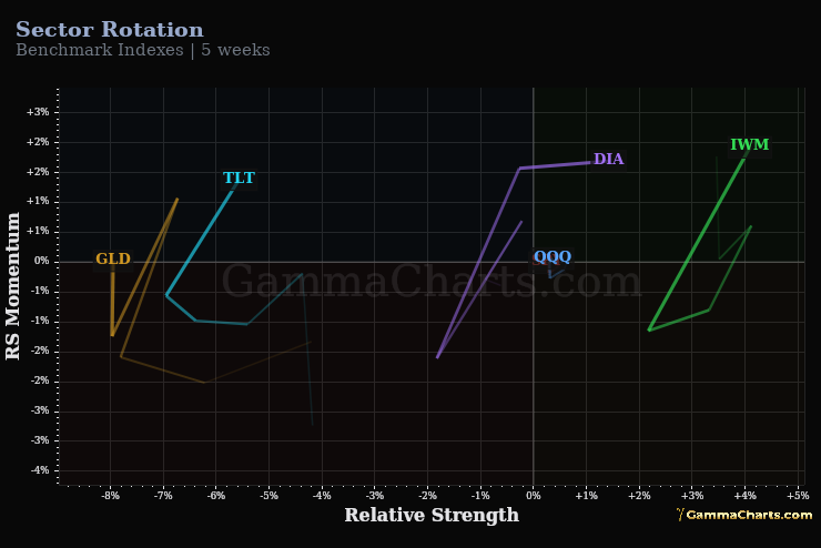
What it shows
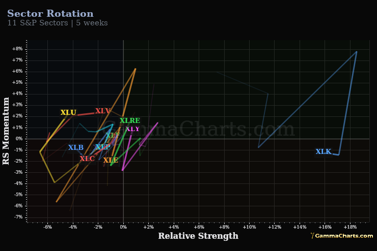
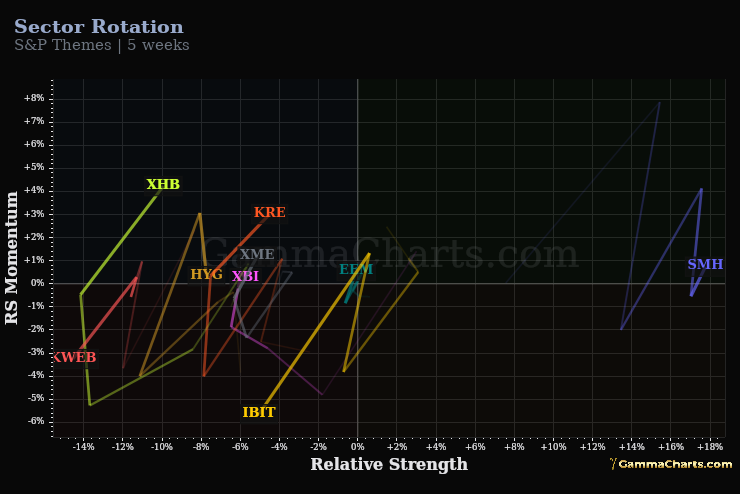
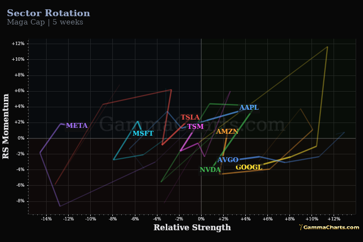
The Relative Rotation Graph plots each asset's relative strength (X) and momentum (Y) vs the group benchmark. Trails show recent rotation paths; quadrant labels show where capital is concentrating.
The rotation quadrants
LEADING
High strength · high momentum — outperforming and accelerating.
WEAKENING
High strength · low momentum — still leading but losing steam.
LAGGING
Low strength · low momentum — underperforming and decelerating.
IMPROVING
Low strength · high momentum — early recovery / catch-up candidate.
How to use it
- Switch preset tabs (sectors, themes, Mag 7) to match the universe you trade.
- Follow trails clockwise: Leading → Weakening → Lagging → Improving is the classic rotation cycle.
- Name moving into Improving while benchmark stays flat often precedes breadth expansion.
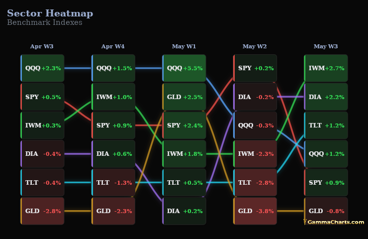
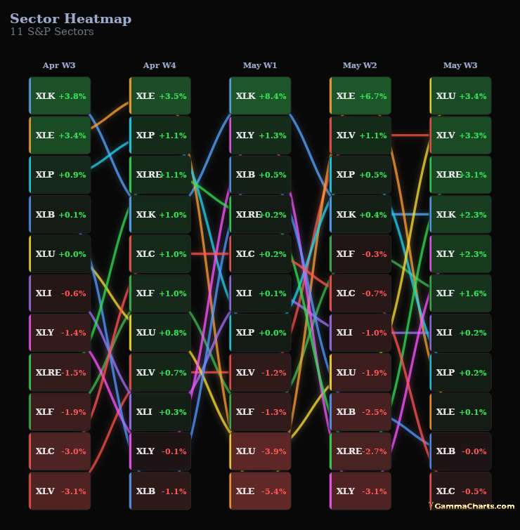
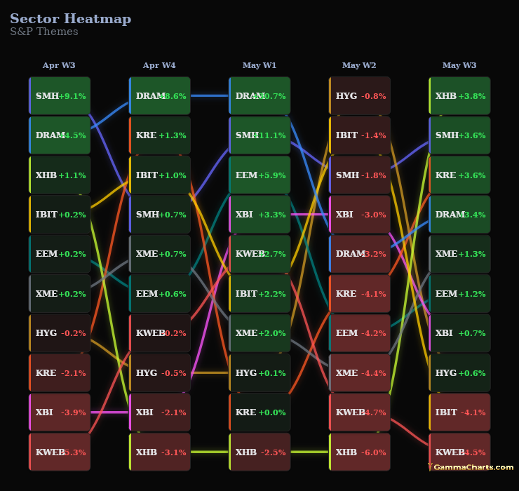
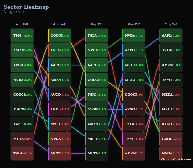
- Pair with the sector heatmap on Macro/Breadth for rank confirmation.