Macro Compass
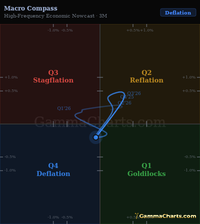
| Date | Quad | Growth | Infl |
|---|---|---|---|
| Aug 26 | Quad 4 | -0.0% | -0.1% |
| Jul 26 | Quad 2 | +0.2% | +0.2% |
| Jun 26 | Quad 2 | +0.2% | +0.5% |
| May 26 | Quad 2 | +0.0% | +0.3% |
| Apr 26 | Quad 2 | +0.1% | +0.1% |
| Mar 26 | Quad 4 | -0.0% | -0.1% |
| Feb 26 | Quad 1 | +0.0% | -0.0% |
| Jan 26 | Quad 3 | -0.3% | +0.0% |
| Dec 25 | Quad 3 | -0.1% | +0.1% |
| Nov 25 | Quad 3 | -0.1% | +0.1% |
| Oct 25 | Quad 2 | +0.1% | +0.2% |
| Sep 25 | Quad 2 | +0.2% | +0.1% |
| Aug 25 | Quad 2 | +0.0% | +0.1% |
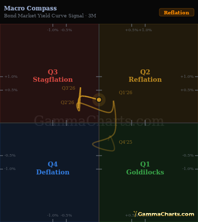
| Date | Quad | Growth | Infl |
|---|---|---|---|
| Aug 26 | Quad 2 | +0.0% | +0.3% |
| Jul 26 | Quad 3 | -0.2% | +0.3% |
| Jun 26 | Quad 3 | -0.2% | +0.1% |
| May 26 | Quad 3 | -0.2% | +0.6% |
| Apr 26 | Quad 3 | -0.2% | +0.1% |
| Mar 26 | Quad 3 | -0.2% | +0.2% |
| Feb 26 | Quad 2 | +0.1% | +0.1% |
| Jan 26 | Quad 2 | +0.1% | +0.2% |
| Dec 25 | Quad 1 | +0.1% | -0.1% |
| Nov 25 | Quad 4 | -0.0% | -0.2% |
| Oct 25 | Quad 1 | +0.1% | -0.4% |
| Sep 25 | Quad 1 | +0.1% | -0.1% |
| Aug 25 | Quad 1 | +0.0% | -0.2% |
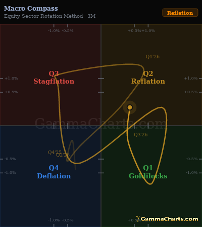
| Date | Quad | Growth | Infl |
|---|---|---|---|
| Aug 26 | Quad 2 | +0.4% | +0.1% |
| Jul 26 | Quad 1 | +0.3% | -0.1% |
| Jun 26 | Quad 1 | +1.2% | -1.5% |
| May 26 | Quad 2 | +1.7% | +0.2% |
| Apr 26 | Quad 4 | -0.3% | -0.6% |
| Mar 26 | Quad 3 | -0.8% | +0.7% |
| Feb 26 | Quad 3 | -0.7% | +1.2% |
| Jan 26 | Quad 2 | +0.7% | +1.6% |
| Dec 25 | Quad 2 | +0.3% | +0.3% |
| Nov 25 | Quad 4 | -0.2% | -0.2% |
| Oct 25 | Quad 4 | -0.5% | -0.6% |
| Sep 25 | Quad 4 | -0.4% | -0.1% |
| Aug 25 | Quad 4 | -0.3% | -0.9% |
| Date | Quad | Growth | Infl |
|---|---|---|---|
| Aug 26 | Quad 2 | +0.1% | +0.0% |
| Jul 26 | Quad 1 | +0.1% | -0.0% |
| Jun 26 | Quad 1 | +0.3% | -0.2% |
| May 26 | Quad 2 | +0.4% | +0.4% |
| Apr 26 | Quad 3 | -0.1% | +0.0% |
| Mar 26 | Quad 3 | -0.3% | +0.2% |
| Feb 26 | Quad 3 | -0.1% | +0.3% |
| Jan 26 | Quad 2 | +0.1% | +0.5% |
| Dec 25 | Quad 2 | +0.0% | +0.1% |
| Nov 25 | Quad 4 | -0.1% | -0.1% |
| Oct 25 | Quad 4 | -0.1% | -0.1% |
| Sep 25 | Quad 3 | -0.0% | +0.0% |
| Aug 25 | Quad 4 | -0.1% | -0.2% |
About
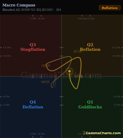
The Macro Compass assigns the economy to one of four regimes based on whether growth and inflation are accelerating or decelerating, using high-frequency nowcasts, yield curve signals, equity rotation, and soft economic data. Use it to place the cycle in growth and inflation space.
Instructions
Read the current quadrant to frame sector and asset-class decisions: each regime favors different assets. Watch for transitions between quadrants, as the shift changes which factors drive returns. Combine with price action to confirm whether the regime is playing out as expected.
Signals
QUAD 1 - Goldilocks
Growth is accelerating while inflation is decelerating. The ideal environment for risk assets. Equities and credit tend to outperform. The Fed is broadly neutral or easing.
QUAD 2 - Reflation
Both growth and inflation are accelerating. Commodities and cyclicals outperform. Nominal assets compress in real terms. The Fed faces pressure to tighten.
QUAD 3 - Stagflation
Growth is decelerating while inflation remains elevated. The worst environment for equities and credit. Real assets and short-duration instruments tend to hold value best.
QUAD 4 - Deflation
Both growth and inflation are decelerating. Long-duration bonds tend to outperform. Equities face earnings risk. The Fed typically has room and motivation to ease.
Tabs
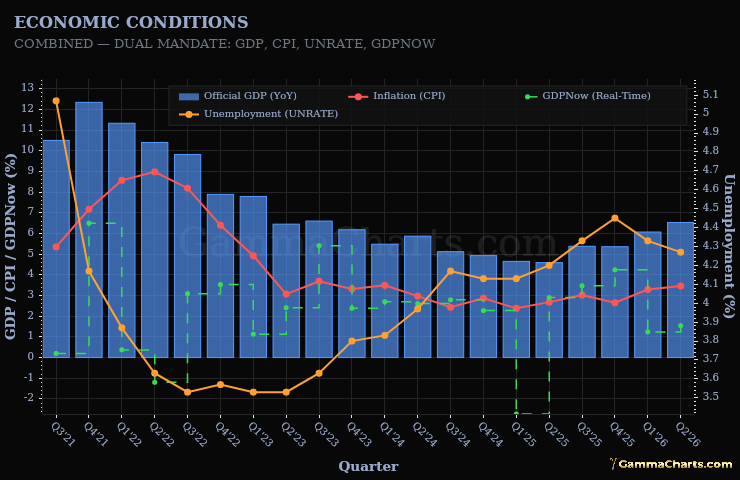
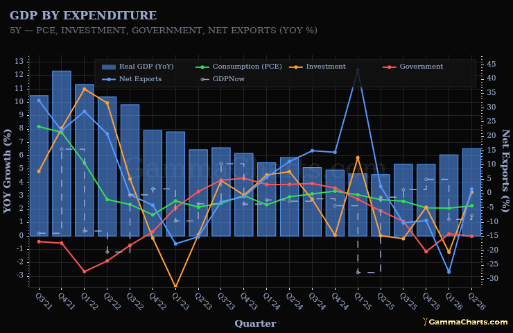
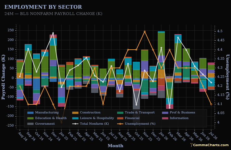
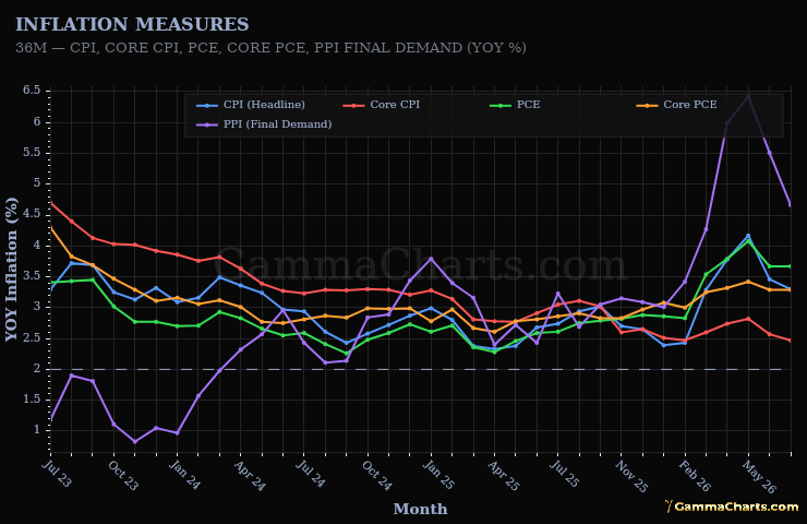
- Nowcast - Payrolls, industrial production, and retail sales for growth. CPI and PCE for inflation. Each axis is the three-month change in year-over-year rates.
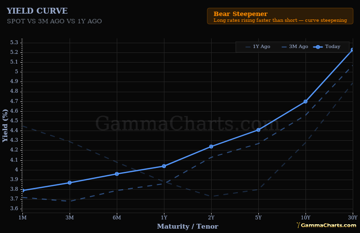
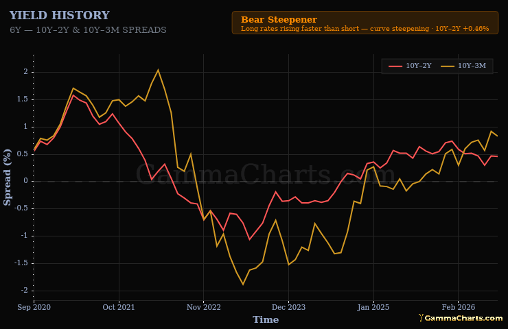
- Yield curve - Three-month change in the 10Y-2Y spread for growth. Three-month change in the 10-year yield for inflation.
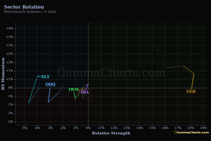
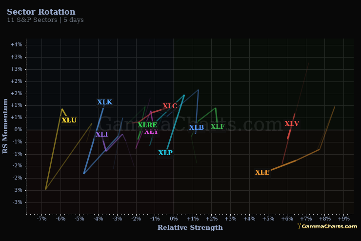
- Equity - Tech versus utilities for growth. Energy and gold versus long Treasuries for inflation. Each axis uses 63-day returns scaled against their own history.
- All - Average of the Nowcast, Yield curve, Equity, and payroll-CPI methods that currently report a quadrant.