Macro Compass
| Month | Quad | Growth | Infl |
|---|---|---|---|
| Jul 26 | Quad 2 | +0.2% | +0.2% |
| Jun 26 | Quad 2 | +0.2% | +0.5% |
| May 26 | Quad 2 | +0.0% | +0.3% |
| Apr 26 | Quad 2 | +0.1% | +0.1% |
| Mar 26 | Quad 4 | -0.0% | -0.1% |
| Feb 26 | Quad 1 | +0.0% | -0.0% |
| Jan 26 | Quad 3 | -0.3% | +0.0% |
| Dec 25 | Quad 3 | -0.1% | +0.1% |
| Nov 25 | Quad 3 | -0.1% | +0.1% |
| Oct 25 | Quad 2 | +0.1% | +0.2% |
| Sep 25 | Quad 2 | +0.2% | +0.1% |
| Aug 25 | Quad 2 | +0.0% | +0.1% |
| Jul 25 | Quad 4 | -0.0% | -0.1% |
| Month | Quad | Growth | Infl |
|---|---|---|---|
| Jul 26 | Quad 3 | -0.2% | +0.4% |
| Jun 26 | Quad 3 | -0.2% | +0.1% |
| May 26 | Quad 3 | -0.2% | +0.6% |
| Apr 26 | Quad 3 | -0.2% | +0.1% |
| Mar 26 | Quad 3 | -0.2% | +0.2% |
| Feb 26 | Quad 2 | +0.0% | +0.0% |
| Jan 26 | Quad 2 | +0.1% | +0.2% |
| Dec 25 | Quad 1 | +0.1% | -0.1% |
| Nov 25 | Quad 4 | -0.1% | -0.2% |
| Oct 25 | Quad 1 | +0.1% | -0.4% |
| Sep 25 | Quad 1 | +0.1% | -0.1% |
| Aug 25 | Quad 1 | +0.1% | -0.2% |
| Jul 25 | Quad 3 | -0.0% | +0.2% |
| Month | Quad | Growth | Infl |
|---|---|---|---|
| Jul 26 | Quad 1 | +0.1% | -0.2% |
| Jun 26 | Quad 1 | +1.3% | -1.3% |
| May 26 | Quad 2 | +1.7% | +0.0% |
| Apr 26 | Quad 4 | -0.5% | -0.5% |
| Mar 26 | Quad 3 | -0.5% | +0.5% |
| Feb 26 | Quad 3 | -0.7% | +1.2% |
| Jan 26 | Quad 2 | +0.7% | +1.5% |
| Dec 25 | Quad 2 | +0.4% | +0.4% |
| Nov 25 | Quad 4 | -0.2% | -0.1% |
| Oct 25 | Quad 4 | -0.3% | -0.4% |
| Sep 25 | Quad 4 | -0.1% | -0.2% |
| Aug 25 | Quad 4 | -0.3% | -0.9% |
| Jul 25 | Quad 1 | +0.4% | -0.5% |
| Month | Quad | Growth | Infl |
|---|---|---|---|
| Jul 26 | Quad 1 | +0.0% | -0.0% |
| Jun 26 | Quad 1 | +0.4% | -0.1% |
| May 26 | Quad 2 | +0.4% | +0.4% |
| Apr 26 | Quad 3 | -0.1% | +0.1% |
| Mar 26 | Quad 3 | -0.2% | +0.1% |
| Feb 26 | Quad 3 | -0.1% | +0.3% |
| Jan 26 | Quad 2 | +0.1% | +0.4% |
| Dec 25 | Quad 2 | +0.1% | +0.1% |
| Nov 25 | Quad 4 | -0.1% | -0.0% |
| Oct 25 | Quad 4 | -0.0% | -0.1% |
| Sep 25 | Quad 1 | +0.0% | -0.0% |
| Aug 25 | Quad 4 | -0.0% | -0.2% |
| Jul 25 | Quad 1 | +0.1% | -0.1% |
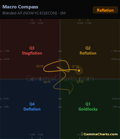
Macro compass
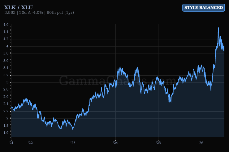
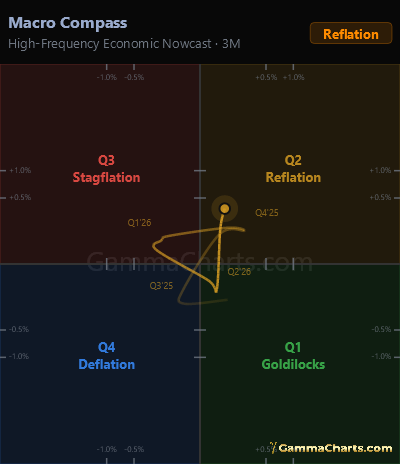
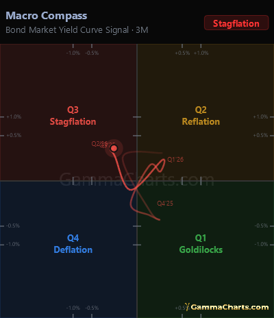
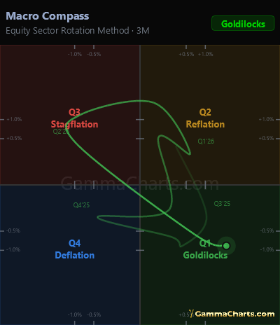
The Macro Compass places the economy in one of four regimes based on whether growth and inflation are currently accelerating or decelerating. These four quadrants define distinct environments with very different implications for which assets perform and which struggle.
The chart is built from multiple methodologies — high-frequency nowcasts, yield curve signals, equity rotation, and soft economic data — with an All tab that blends active legs. Use the regime to calibrate your sector and asset class positioning, not as a trade signal, but as the lens through which to interpret everything else.
Badge states (quadrants)
QUAD 1 — Goldilocks
Growth is accelerating while inflation is decelerating. The ideal environment for risk assets. Equities and credit tend to outperform. The Fed is broadly neutral or easing.
QUAD 2 — Reflation
Both growth and inflation are accelerating. Commodities and cyclicals outperform. Nominal assets compress in real terms. The Fed faces pressure to tighten.
QUAD 3 — Stagflation
Growth is decelerating while inflation remains elevated. The worst environment for equities and credit. Real assets and short-duration instruments tend to hold value best.
QUAD 4 — Deflation
Both growth and inflation are decelerating. Long-duration bonds tend to outperform. Equities face earnings risk. The Fed typically has room and motivation to ease.